
Written by Kaira
Modified & Updated: 01 Dec 2024
Reviewed by Sherman Smith
We can’t help but feel inspired when we encounter different types of purple in our daily lives. No matter which generation you grew up in, the various shades of purple always manage to stay on-trend. To achieve your desired type of purple, you must remember to use shades of blue and red. The two primary colors may emit contrasting emotions but that’s what makes purple unique. The marriage of calming blues and intense reds creates the elegance and energy of purple we know and love. Who knew this beloved color could be so complex?
When we buy stuff labeled “purple,” it doesn’t mean that other things feature the same shade or tone. That purple Starbucks tumbler you’ve been eyeing does not offer the same shade as your favorite purple t-shirt. Like most colors, experts broke down purple into different types to help us appreciate several shades. Don’t challenge art buffs and meticulous designers by saying all types of purple look the same. Learn to familiarize yourself with the different tones and shades of purple. Read the information we prepared about the different purple shades you need to know about.
History Behind the Different Types of Purple
Before anything else, let’s start with the basics. Like most things, the color purple presents a long history. Yes, we can get a beautiful purple shade after mixing blue and red. However, getting the purple shades we liked wasn’t easy in Ancient Times. The earliest records of the purple dye came from the City of Tyre. To honor the city, they named the expensive hue “Tyrian Purple.” People produced the dye by harvesting the mucus from Murex Snails. Back then, people considered the hue rare and exotic. Because of this, the types of purple available then came with a hefty price tag. Considered a rare dye, purple or violet became associated with royalty, wealth, and power.
We automatically relate purple or violet to royalty due to the long history behind the color. As mentioned, the purple dyes came with extravagant price tags due to their complicated process. Royalty and nobles from Rome, Egypt, and Persia held the color with such high regard. In recent history, famous personalities like Prince became associated with the color purple. Aside from being an accomplished musician, Prince made his legendary acting debut starring in the 1984 rock musical drama “Purple Rain.” The song and album with the same continue to garner fame to this day.
The Difference Between the Shades of Purple and Violet
Some people can’t help but argue over purple vs. violet. Visually, they look the same but their difference lies in their respective wavelengths. The violet color features about 380–450 nanometers in wavelength. This makes the royal hue belongs hold a place in the visible light spectrum. That small difference keeps it from being added to the hues under ultraviolet light. Overall, you can see violet with your eyes as a color containing more blue than red.
Unlike the violet color, a ratio of about 1:1 of blue and red forms the color purple we know of. When you think of it that way, the two colors bring out similar qualities. However, purple showcases the perfect blend of blue and red whereas violet stands out on its own. You can take the Shakespeare quote “violets are blue” into consideration. Our eyes see things differently from other animals. We see violets and associate them with more blue than red. When you look at a natural purple or violet pattern, our eyes cannot entirely see all of its details. For example, petals from a violet flower appear to animals and us. We see the violet petals as they are but they appear with more intricate patterns and colors to animals. Because of this, we often regard purple as a saturated version of violet. Additionally, the usual cameras we use cannot help our case. Since people designed cameras, they offer the same visuals as the human eye. Despite their visual similarities, the shades of purple and violet stand out by themselves.
Purple Color Palette: Pairing Colors That Go With Purple
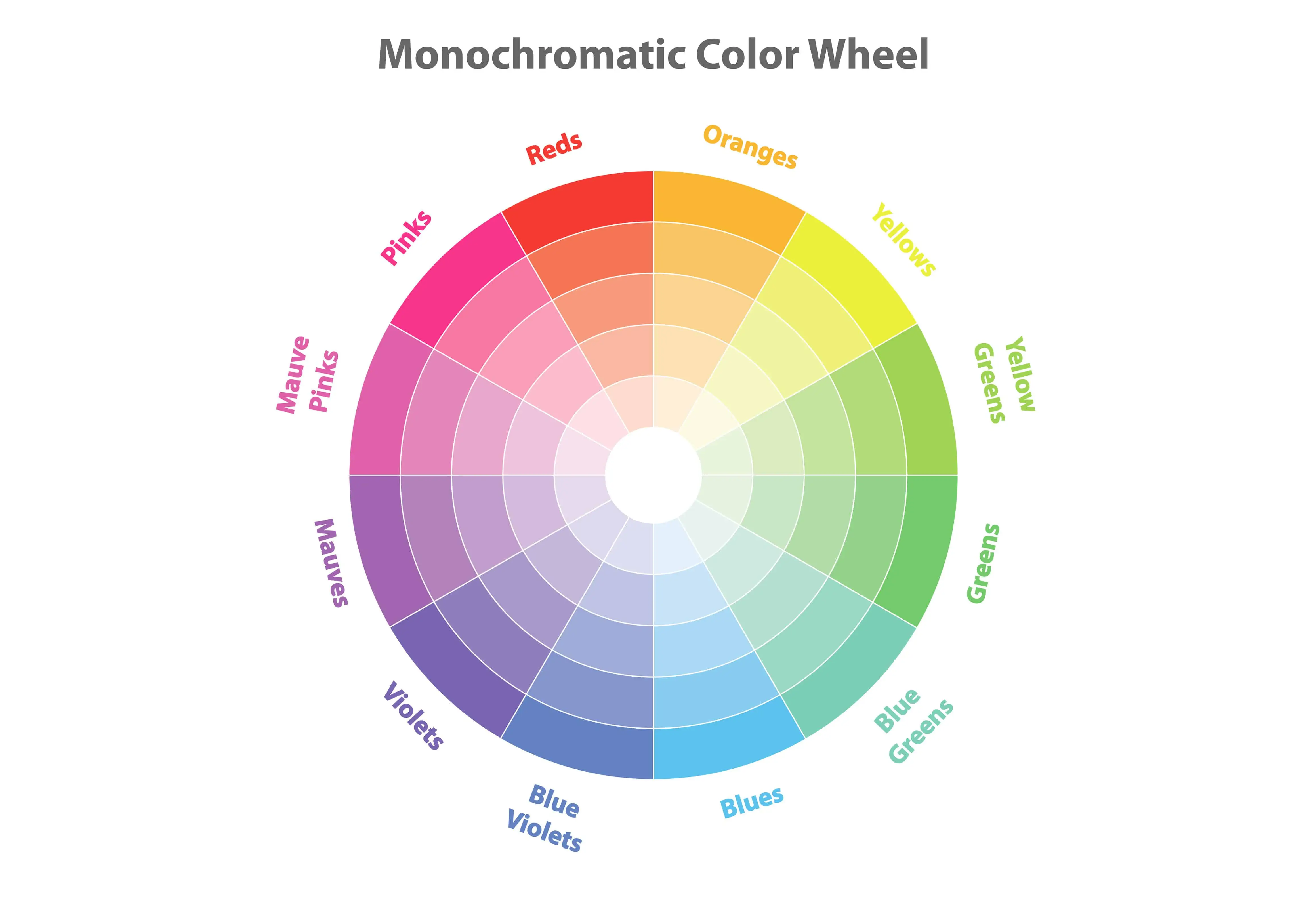
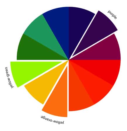
All types of purple do look elegant enough by themselves. However, you may also use the color wheel to find shades that complement purple or violet. When you pair complementary colors together, the result is visually pleasing to almost everyone. Take the classic Christmas colors as an example. The colors green and red directly complement each other in the color wheel. The balance between the two colors resulted in the festive feel we know and love every holiday season. Using the color wheel, purple directly complements yellow. With this, you can easily pair your purple accessories, bags, etc with yellow or gold-toned products.
Designers and artists also consider the beautiful pairing between split-complementary colors to attract more viewers or clients. You can try checking out the concept by distinguishing the colors placed opposite each other on the wheel. Afterward, pick out the two colors next to the direct complementary color. Those two colors play as your picked shade’s split-complementary colors. For example, the color purple directly complements yellow in the color wheel. Because of this, the two colors next to yellow, yellow-green and yellow-orange, work as purple’s split-complementary colors.
After learning about purple’s complementary colors, you can now try mixing or blending other tones and hues. Start fresh by mixing the complementary hues with neutral colors such as black, white, beige, and brown. You may also go bold and add patterns and purple color swatches into the mix. With this, you can experiment with what to pair with the royal color. To learn more about pairing colors, check out our descriptions below for the different types of purple we encounter.
The Importance of Types of Purple Hex Codes
Before jumping into the uses of the different types of purple, you must know the importance of its hex codes. People familiar with coding also call it Hexadecimal Color Codes. Don’t worry, we won’t bore you with its role in coding. A simpler explanation lies in the overall role of hex codes. Typing in a hex code in itself in Google yields results about the color it represents. Learning about the seemingly endless color spectrum becomes easier with hex codes. Thanks to the codes, you can see the differences between the several types of purple we see every day.
Purple or Patriarch (#800080)
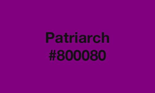
Before we discuss the other types of purple, you need to know about Purple. Also known as Patriarch, the true Purple shade features a darker shade of magenta. If you examine its hex code, about 50.2% red and 50.2% blue make up Purple’s RGB color model. Using its hex code, you can determine that the complementary color of Purple (#800080) is Green (#008000). The split complementary colors for this shade consists of a medium-dark tone of green-cyan (#00805C) and green (#3A8000). These colors offer the best mix with the famous color. We suggest you also try it with neutral shades like gray and off-white for a vintage feel.
At a distance, Purple (#800080) looks like the shades named Philippine Violet (#81007F) and Mardi Gras (#880085). When inverted, the shade depicts a medium-light shade of green (#7FFF7F). You may use this particular shade to tone down purple when painting or designing. It may be a bold style decision but you just might like it.
Dark Purple or Purple4 (#551A8B)
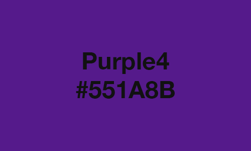
From afar, Dark Purple (#551A8B) features a similar shade to most violet tones. It emits a wavelength measuring about 565.66 nanometers. Because of this, it appears to consist of more blue than red. In truth, Dark Purple contains 33.33% red, 54.51% blue, and 10.2% green. So, yes, it does have more blue than red. However, you probably didn’t expect that slight percentage of green. Experts describe it as displaying a medium-dark shade of blue-magenta. Artists compare it to American Violet (#551B8C) and Metallic Violet (#5B0A91). Like most types of purple, Dark Purple complements a shade certain shade of green. In this case, this purple shade goes well with medium-dark green (#00A500).
Tyrian Purple (#66023C)
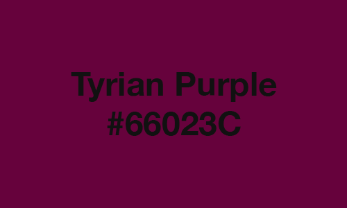
Tyrian Purple (#66023C) hails as one of the earliest types of purple ever discovered. We mentioned earlier the meticulous process of getting its pigment from Murex snail mucus. Because of this, people considered the natural dye rare and only fit for royals and nobility. Also known as Imperial Purple, the illustrious shade consists of 40% red, 23.53% blue, and 0.78% green. Due to its dominant red tone, most people don’t mistake it for violet. From afar, color experts distinguish it as a dark shade of magenta pink.
For balance, you may match Tyrian Purple with its complementary color of dark green-cyan (#006842). However, you might find it difficult to find that exact shade since it remains unnamed. To narrow your search, inquire about closely related colors like Green Bamboo Color (#006442) or Dartmouth Green (#00703C). If Tyrian Purple piques your interest, we suggest you also look out for clothes or accessories with shades close to them. Go ahead and ask about purple colors like Dark Tyrian (#400125) or Royal Silk (#4B3841).
English Violet (#563C5C)
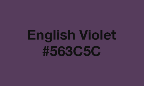
Because of its wide usage, you might be most familiar with English Violet (#563C5C) among all types of purple. Most people describe it as a medium-dark shade of magenta. However, the color is a result of 33.73% red, 36.08% blue, and 23.53% green. The shade also looks similar to popularly used purples like Japanese Violet (#5B3256) and Dark Byzantium (#5D3954). Its direct complementary color, medium-dark green (#3B5F39), matches well in designs and fabrics. However, most designers choose Canary (#FFFF99 or #FF9) to emphasize and blend with English Violet (#563C5C). At a distance, these two colors highlight each other’s beauty, depending on the quantity used. We suggest you try mixing shades associated with them for flower arrangements.
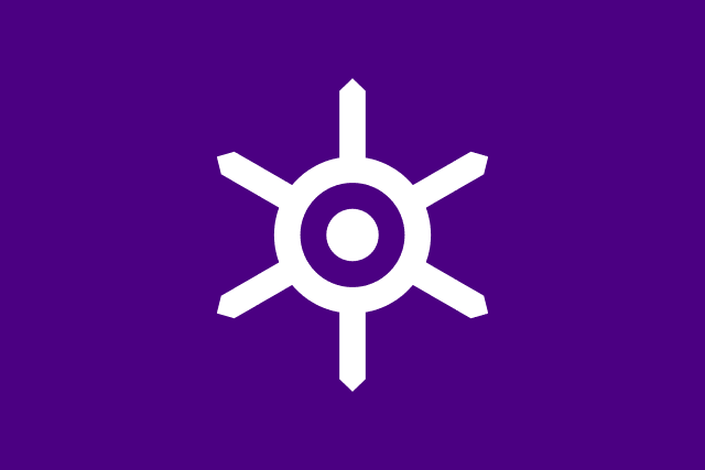
Indigo (#4B0082)
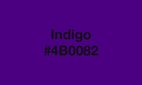
Among all types of purple, Indigo (#4B0082) stands out for belonging to the rainbow’s spectrum of colors. Its RGB color model holds a blend of 29.41% red and 50.98% blue. This makes it a bit similar to Purple (#800080) with its lack of green in the mix. You may highlight Indigo’s beautiful shade by pairing it with immediately related tones. Some of the named colors that fall in that category include Pastel Brown (#836953) and Plain Mouse (#6E5f57). If you traveled to Japan, you might have noticed Indigo’s role in the design of the Tokyo Flag. Additionally, its complementary color with a medium-dark green tone (#008200) is seen in the Roraima flag.
Dark Violet (#9400D3)
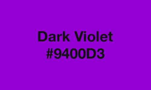
Like most people, we admit that we overlooked the unique hue of Dark Violet (#9400D3). Contrary to its name, this type of purple doesn’t look dark from afar. It also looks similar to named purple shades like French Violet (8806CE) and Blue-violet (8A2BE2). Dark Violet may seem bright but the tone contains about 58.04% red and 82.75% blue. Using its complementary color green (#00D300), we encourage you to match Dark Violet with its designated split-complementary shades. The brightness of green-cyan (#00D35B) and muted tone of yellow-green (#92D300) blend well with Dark Violet’s vibrance. Intermediately related under this shade include Poppy Petal (#F6A08C) and Brown Coffee (#4A2C2A). You may also use these colors as an alternative to preparing color themes with Dark Violet.
Lilac (#CEA2FD)
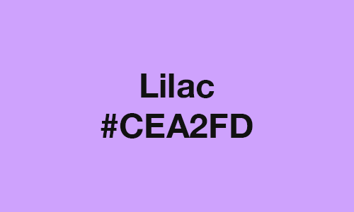
Out of all subtle types of purple, Lilac (#CEA2FD) hails as one of the most favored tones by almost anyone. It doesn’t stand out like other purple shades. The color consists of about 80.78% red, 99.22% blue, and 63.53% green. Because of this composition, almost all of Lilac’s distantly colors feature different shades of black. You may match it with almost any color aside from complementary shades. Its direct complementary color is light green (#CBE4BB). The colors next to it include light yellow (#E6E2B9) and light green-cyan (#B5EAD3). You may also link Lilac with colors like Tuscan Red (#7C4848) and Mellow Apricot (#F8B878). All mentioned colors go well with the muted tone of Lilac.
Purple Rain or Purple Heart (#7442C8)
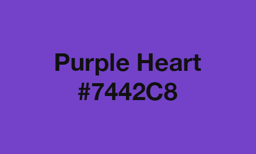
Visually, Purple Rain (#7442C8) looks a lot like Dark Violet (#9400D3). However, this purple shade contains about 25.88% green, unlike Dark Violet. It also consists of about 45.49% red and 78.43% blue. The shade got its name from Prince’s famous works. He described Purple Rain as the result of blood in the sky, the blend of red and blue. The late artists also intended to symbolize letting one’s faith guide them to the end of the world. You may honor Prince’s memory by matching Purple Rain with its bold complementary color. The bright green (#0BFF0B) goes well with the unique purple shade along with yellow (#FFFA0B) and green-cyan (#0BFF67). You may also try preparing a selection of colors for Purple Rain with its inverted version, green (#8BBD37).
Lavender (#B56EDC)
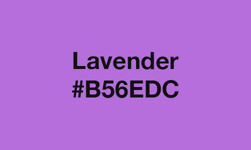
Designers and artists use Lavender (#B56EDC) to reference the shade of the beloved flower of the same name. However, its floral shade features the hex code #B57EDC. It may not be obvious but our eyes can spot the subtle difference between the two Lavender shades. Lavender (#B56EDC) contains approximately 70.98% red, 86.27% blue, and 43.14% green. Like Lilac, this purple shade’s lightness makes its distantly related colors consist mainly of black dyes. Meanwhile, Lavender’s complementary color is a medium-light green (#86D278). This makes green-cyan (#4BFFC3) and yellow-green (#F4FF4B) as its split-complementary colors. If you want to stand out, you can match Lavender with its intermediately related colors like Mulberry Dye (#59292C) or Red-bronze (#FB8136).
Grape (#6C3461)
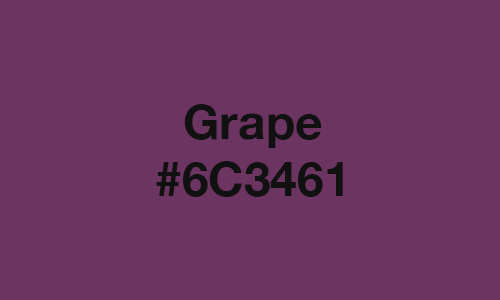
Grape (#6C3461) is one of the types of purple we envisioned to look like the fruit of the same name. In truth, real-life grapes usually offer a saturated purple tone (#663A5E). It looks similar to Byzantium (#702963) and Palatinate Purple (#682860). This type of purple contains about 38.04% blue, 42.35% red, and 20.39% green. Because of this composition, the shade’s distant colors like Lemon Yellow (#FFFF9F) and Daffodil (#FFFF31) go well in designs. We also advise you to check out Grape’s complementary color, green-cyan (#0B9554). Most people favor its split-complementary shade Pantone 10296 C (#00A08D) over the medium-dark green (#567C24) dye. But, we still suggest you try matching it with Grape’s inverted color, medium-light green (#93CB9E).
Neon Purple (#BC13FE)
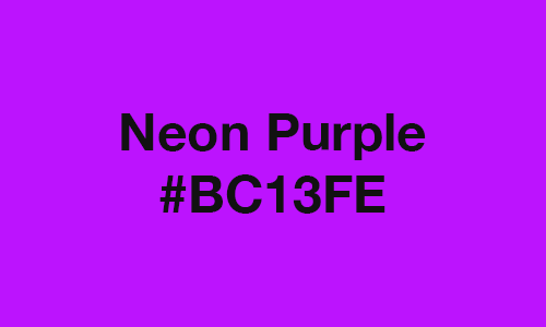
Due to its intense brightness, color experts consider Neon Purple (#BC13FE) as a shade of magenta. The vibrant purple is the result of 99.61% blue, 73.73% red, and about 7.45% green. That small hint of green adds just the right amount of brightness to make Neon Purple stand out at a distance. You may try to tone down its intensity by matching it with intermediate related shades like Heliotrope Gray (#AA98A9) or Moonstone Blue (#73A9C2). For additional vibrance, we suggest you blend Neon Purple with its complementary color, green (#12FF12). Split-complementary shades green-cyan (#12FF86) and yellow-green (#B2FF12) also accentuate the purple color’s lightness. However, blending these colors with Neon Purple may be blinding to some people up close.
Beets (#736A86)
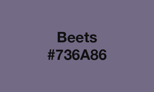
You probably wondered how Beets (#736A86) got its name despite its light color. In truth, California Paints Beetroot (#673F45) looks more like the mentioned known root vegetable. At a distance, you may mistake it for Old Lavender (#796878) or Mousy Wisteria Fujinezumi (#766980). This came from the fact that Beets contains about 52.55% blue, 45.1% red, and 41.57% green. To ease your worries, you may mix Beets and California Paints Beetroot in hopes of staying true to the vegetable tones. For a calming effect, we encourage you to pair the purple shade with its inverted color, yellow-green (#8C9579). With this, the dull yellow-green shade highlights the subtle vibrance of the purple Beets.
Ultra Violet or Blue-Violet (#7366BD)
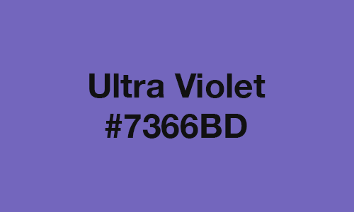
Among all types of purple, Ultra Violet or Blue-Violet (#7366BD) might help you remember a few childhood memories. This purple hue gained popularity for being Crayola’s official Blue-violet shade. We also associate it with the Violet-blue (#766EC8) crayon that offers a different tone when used. Like most crayons, you’ll only see their true color once you use them on paper. The beloved hue became possible after blending about 74.12% blue, 45.1% red, and 40% green. Aside from its green (#A5D350) complementary color, you may also match Ultra Violet with green-cyan (#36ED8E) or yellow (#ECCA37). The two split-complementary colors bring a pleasing combination when used in painting, fabric patterns, etc.
Royal Purple (#4B006E)
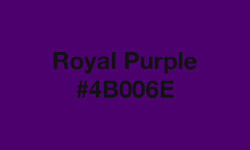
True to its name, Royal Purple (#4B006E) emits a regal atmosphere when dyed in fabrics, clothes, accessories, etc. The deep purple hue is the result of 43.14% blue and 29.41% red. Like most dark violet shades, Royal Purple does not contain any percentage of green. Add a more extravagant feel to the shade by matching it with Flame (#E25822) or Brunswich Green (#1B4D3E). Of course, you can never go wrong with pairing it with its complementary color, dark green (#006E00). Distantly related shades like Guyabano (#F8F8F8) and Canary (#FFFF99) also go great with Royal Paper in paints. We suggest you blend these colors to create a beautiful ombre effect on your canvas.
Pastel Violet (#CB99C9)
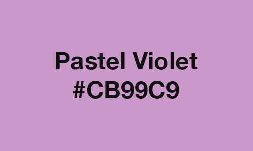
Pastel Violet (#CB99C9) gained fame for being one of the most favored pastel shades during the trend of pastel-colored anything. Because of its serene effect, most people thought Pastel Violet contains more blue than red. However, the calming hue consists of 79.61% red, 78.82% blue, and 60% green. It looks more pleasing when you match it with its complementary color, medium-light green (#9DC7A4). Another famous combination with Pastel Violet comes from pairing it with yellow-green (#BDC69E). The muted shade blends well with the purple hue because it plays as its split-complementary shade. Plus, we also find its triad color, medium-light yellow (#D0BD94), a great match with Pastel Violet.
Eggplant (#483248)
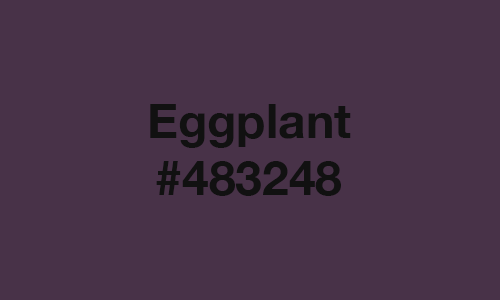
True to its name, Eggplant (#483248) appears as the purple hue of most ripe aubergines. We say ripe because the growing state of the vegetable features the shade Light Eggplant (#894585). The Eggplant color contains about 28.24% blue, 28.24% red, and 19.61% green. The hint of green mutes the equal balance of blue and red. The beautiful combination causes people to mistake it for famous Japanese purple shades like Murasaki (#4F284B) and Kokimurasaki (#3A243B). You may amplify its regal feel by matching it with its complementary color, dark green (#2F4B32). Plus, using distantly related colors like Laser Lemon (#FFFF66) makes the Eggplant hue pop out.
Purple Sapphire (#6F4685)
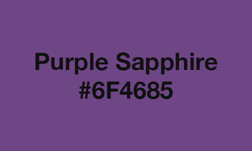
Much like its name, Purple Sapphire (#6F4685) features the tone of the beloved stone. It looks similar to Eminence (#6C3082) and Maximum Purple (#733380). The elegant purple shade is composed of about 52.16% blue, 43.53% red, and 27.45% green. Aside from jewelry, you may witness the vibrance of Purple Sapphire as bright violet lights blend with the night sky. You may not realize it but not a lot of designers blend Purple Sapphire with its direct complementary color, medium-dark green (#489239). Instead, most designers pair the elegant shade with neutral colors like black and white. When inverted, you get a gorgeous muted shade of green (#90B97A). This may seem like a bold pairing with Purple Sapphire but the dulled tone works well with the purple’s vibrance.
Ripe Plum (#410056)
Among all types of purple, the Ripe Plum (#410056) is widely used for its neutral tone. It’s not too dark and not too late. A combination of 33.73% blue and 25.49% red resulted in the subtle vibrance of this purple hue. From afar it looks like Russian Violet (#32174D). However, it does not contain any hint of green, unlike the deep violet shade. You may tone it down by pairing it with its inverted shade, light green (#BEFFA9). Matching it with its complementary color, dark green (#005600), creates a dark yet elegant combination. Using that as a reference, you can see why jewelry designers like releasing purple sapphire pieces with emeralds.
Was this page helpful?
Our commitment to delivering trustworthy and engaging content is at the heart of what we do. Each fact on our site is contributed by real users like you, bringing a wealth of diverse insights and information. To ensure the highest standards of accuracy and reliability, our dedicated editors meticulously review each submission. This process guarantees that the facts we share are not only fascinating but also credible. Trust in our commitment to quality and authenticity as you explore and learn with us.