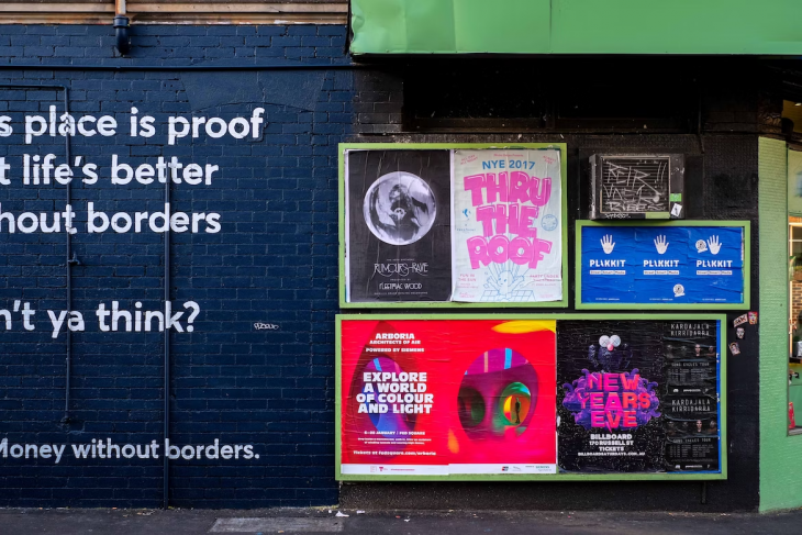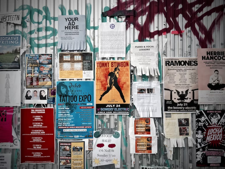
In today’s competitive world, event promotion is crucial to attract the right audience and make your event a success. One of the most effective ways to promote your event is by designing eye-catching posters that grab people’s attention. Whether it’s for a concert, festival, or exhibition, you can create a poster at StoryboardThat to generate interest in your event. In this article, we’ll discuss the essential elements of designing attention-grabbing posters and share some tips on how to make your event stand out from the crowd.
1. Know Your Audience
Before you start designing your poster, it’s essential to have a clear understanding of your target audience. Knowing who your audience is will help you determine the visual elements, colors, typography, and messaging that will resonate with them. Consider factors such as age, gender, interests, and location to create a design that appeals to your target demographic.
2. Choose the Right Size and Format
The size and format of your poster will depend on where it will be displayed and how it will be used. For large outdoor spaces like billboards or building walls, you’ll need a larger format, whereas smaller posters are suitable for indoor spaces like cafés, shops, or galleries. Keep in mind that your poster should be easily readable from a distance, so ensure that the text and graphics are scaled accordingly.
3. Use Striking Visuals
Visuals play a significant role in capturing people’s attention, so choose images or illustrations that are striking and relevant to your event. High-quality photographs, bold graphics, and unique illustrations can all be effective visuals for your poster. If you’re promoting a concert, consider using an image of the performer or band. For festivals and exhibitions, showcase the event’s theme or main attraction. Remember, your visuals should evoke the atmosphere and energy of your event.
4. Select a Color Scheme
Colors can evoke emotions and create a mood, so choose a color scheme that reflects the vibe of your event. Bold, vibrant colors can make your poster stand out and grab attention, while softer, muted tones can convey a more sophisticated or elegant feel. Consider using colors that match your event’s branding or theme, and ensure there’s enough contrast between the background and text to ensure readability.
5. Pick the Right Typography
Typography is another critical element in poster design, as it can impact the overall look and feel of your poster. Choose fonts that are easy to read and complement your chosen visuals and color scheme. Limit the number of fonts you use to maintain a clean, cohesive design – ideally, stick to one or two different fonts. You can also play with font sizes, weights, and styles to create a visual hierarchy and emphasize essential information.
6. Craft a Compelling Headline
Your poster’s headline should be concise, engaging, and informative. It should clearly communicate the purpose of your event and entice people to learn more. Use action words and phrases that evoke excitement, curiosity, or urgency. Make sure your headline is prominent and easily readable, as it’s often the first thing people will notice on your poster.
7. Include Essential Information
While your poster should be visually appealing, it also needs to convey essential information about your event. Be sure to include the following details:
- Event name
- Date and time
- Venue/location
- Ticket prices (if applicable)
- Contact information (website, phone number, or email)
- Social media handles or hashtags
Keep the information organized and easy to read by using bullet points, numbered lists, or separate sections for different details.
8. Add a Call-to-Action
Encourage people to take action by including a clear call-to-action (CTA) on your poster. This can be as simple as “Buy Tickets Now,” “RSVP Today,” or “Visit Our Website for More Information.” Make sure your CTA is easy to find and stands out from the rest of the design.

9. Leave Some Negative Space
While it’s essential to include all relevant information and visuals, don’t overcrowd your poster with too many elements. Leaving some negative space – the empty areas around your design elements – can make your poster feel more balanced, organized, and easier to read.
10. Understand the Principles of Design
To create a visually appealing and effective poster, it’s essential to understand the basic principles of design. They include balance, contrast, emphasis, movement, pattern, rhythm, and unity. By applying these principles to your poster design, you can create a cohesive and harmonious layout that effectively communicates your event details.
Balance
Balance refers to the equal distribution of visual weight in your design. A balanced poster will feel more stable and organized, making it easier for viewers to process the information. You can achieve balance by using symmetry (mirroring elements on either side of the design) or asymmetry (using different elements to create a sense of equilibrium).
Contrast
Contrast helps to create visual interest and draw attention to specific elements of your poster. This can be achieved through color, size, shape, or typography. For example, use contrasting colors for your background and text to ensure readability, or vary the size of your fonts to create a visual hierarchy.
Emphasis
Placing emphasis means highlighting the most critical information or element in your design. You can do this by using different sizes, colors, or positioning. For instance, make your headline larger than the rest of the text, or use a bold color to draw attention to the event date and time.
Movement
Movement refers to the way the viewer’s eye travels through your design. By carefully arranging elements in your poster, you can guide the viewer’s eye in a specific direction, ensuring that they absorb all the necessary information. Use lines, shapes, or the arrangement of text to create a sense of flow in your design.
Pattern
A pattern is the repetition of elements that forms visual consistency and rhythm. Patterns can be created with similar shapes, colors, or textures throughout your design. Patterns can help to create a sense of unity and harmony in your poster.
Rhythm
Rhythm is the repetition of elements with slight variations to create a sense of movement and flow. You can add rhythm to your design by alternating colors, shapes, or sizes. Rhythm can help to guide the viewer’s eye through your poster and create a more dynamic layout.
Unity
Unity is the overall harmony and cohesion of your design. By ensuring that all elements of your poster work together seamlessly, you can create a more polished and professional look. To achieve unity, ensure consistent use of colors, typography, and imagery.
11. Experiment with Layouts and Composition
Don’t be afraid to experiment with different layouts and compositions when designing your poster. Try rearranging elements, playing with different alignments, or using grids to create a more structured design. Testing various layouts can help you discover the most effective way to present your event information and create a visually appealing poster.
12. Incorporate Branding Elements
If your event is associated with a specific brand or organization, be sure to incorporate their branding elements into your poster design. This can include logos, color schemes, typography, and other visual elements. Consistent branding helps to create a professional appearance and reinforces the event’s association with the brand.
13. Test and Refine Your Design
Before finalizing your poster design, gather feedback from others to ensure that it’s visually appealing and effectively communicates your event details. Ask for opinions on the overall design, readability, and whether the poster captures the essence of your event. Use this feedback to refine your design and make any necessary adjustments.
14. Use High-Quality Printing Materials
The quality of your printed poster can have a significant impact on its overall effectiveness. Invest in high-quality printing materials to ensure that your poster looks polished and professional. Choose durable paper or cardstock with a suitable finish (matte, glossy, or semi-gloss) to enhance the appearance of your design.
15. Distribute Your Poster Strategically
Once you’ve designed and printed your attention-grabbing poster, it’s essential to distribute it strategically to reach your target audience. Consider placing your posters in high-traffic areas where your target demographic is likely to see them, such as shopping centers, public transportation hubs, or popular entertainment venues. Additionally, leverage social media and online platforms to share a digital version of your poster with a wider audience.
16. Monitor Your Poster’s Effectiveness
After your poster has been distributed, monitor its effectiveness by tracking ticket sales, RSVPs, or website visits. This will help you gauge the success of your poster design and inform future promotional efforts. If you find that your poster isn’t generating the desired results, consider revising your design or distribution strategy to better target your audience.
Conclusion
Creating attention-grabbing posters for concerts, festivals, and exhibitions requires a thoughtful approach to design principles, visuals, typography, colors, and messaging. By following these tips and continually testing and refining your design, you can create a powerful promotional tool that generates excitement and interest in your event.
Remember to always keep your target audience in mind and use high-quality materials and printing to ensure a professional appearance. With a compelling poster, you’ll be well on your way to event promotion success.
Was this page helpful?
Our commitment to delivering trustworthy and engaging content is at the heart of what we do. Each fact on our site is contributed by real users like you, bringing a wealth of diverse insights and information. To ensure the highest standards of accuracy and reliability, our dedicated editors meticulously review each submission. This process guarantees that the facts we share are not only fascinating but also credible. Trust in our commitment to quality and authenticity as you explore and learn with us.
