
Media queries are a powerful tool in web design, enabling websites to adapt to different screen sizes and devices. But what exactly are media queries, and why are they so important? Media queries allow developers to apply specific styles based on the characteristics of the device, such as its width, height, or orientation. This ensures that a website looks great whether viewed on a smartphone, tablet, or desktop. They play a crucial role in responsive design, making websites more user-friendly and accessible. In this post, we'll dive into 27 fascinating facts about media queries that will help you understand their significance and how to use them effectively.
What Are Media Queries?
Media queries are a fundamental part of responsive web design. They allow websites to adapt to different screen sizes and devices, ensuring a seamless user experience. Here are some interesting facts about media queries:
-
Media queries were introduced in CSS3, revolutionizing how web designers approached responsive design.
-
They enable different styles to be applied based on device characteristics like screen width, height, orientation, and resolution.
-
The most common use of media queries is to create breakpoints, which adjust the layout of a webpage at specific screen widths.
How Media Queries Work
Understanding how media queries function can help you make better design decisions. Let's dive into the mechanics:
-
A media query consists of a media type and one or more expressions that check for conditions of particular media features.
-
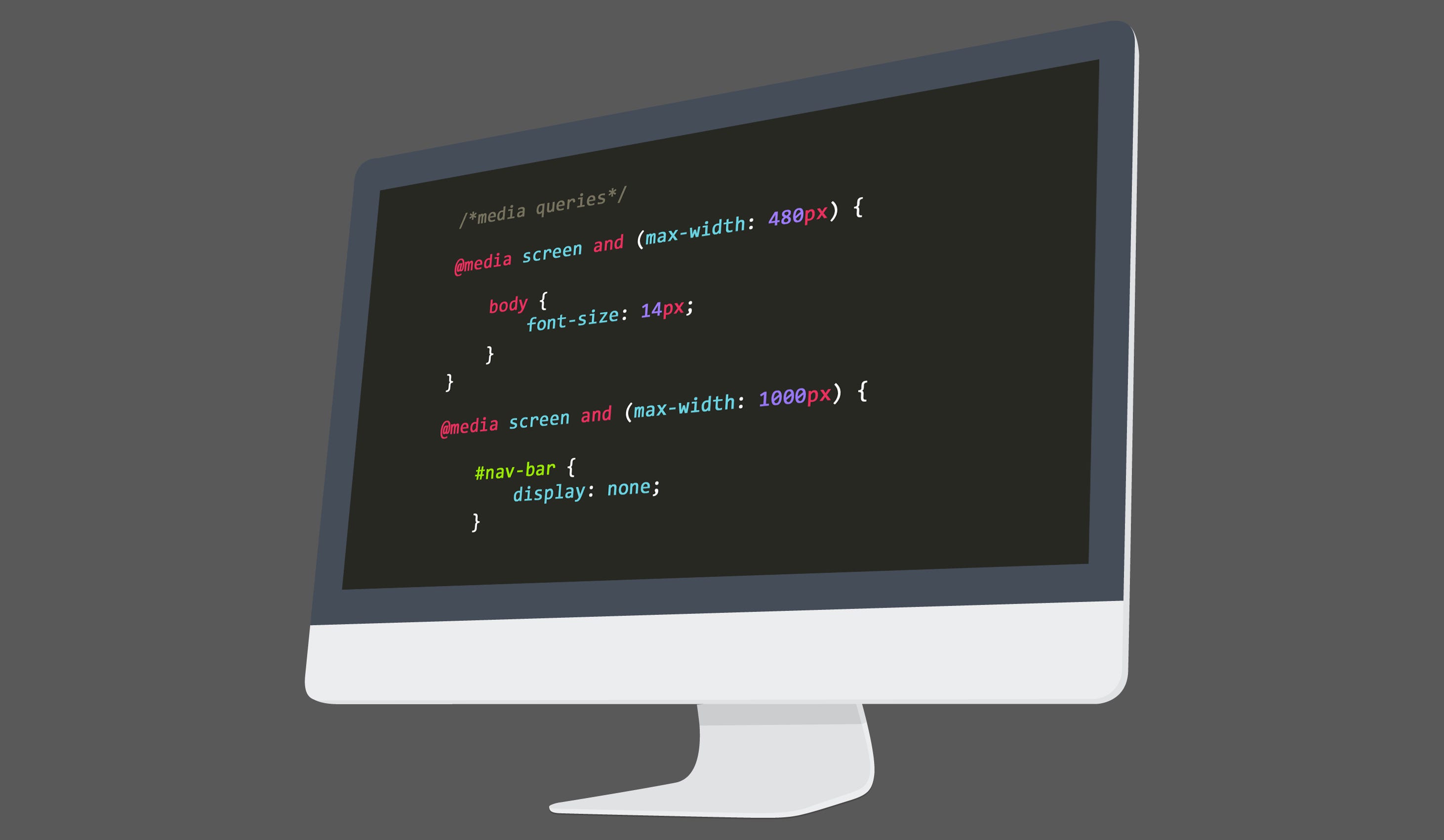
The
@mediarule is used to define media queries in CSS. For example,@media screen and (max-width: 600px)targets screens that are 600 pixels wide or less. -
Media queries can be combined using logical operators like
and,not, andonlyto create more complex conditions.
Practical Applications of Media Queries
Media queries have numerous practical applications in web design. Here are some ways they are commonly used:
-
They help create fluid grids that adjust the number of columns based on screen size.
-
Media queries can hide or show elements depending on the device, improving usability and performance.
-
They allow for different font sizes and line heights on various devices, enhancing readability.
Media Queries and Mobile-First Design
Mobile-first design is a popular approach in web development. Media queries play a crucial role in this strategy:
-
In mobile-first design, styles for smaller screens are written first, with media queries used to add styles for larger screens.
-
This approach ensures that the website is optimized for mobile devices, which are increasingly the primary way people access the internet.
-
Mobile-first design often results in cleaner, more efficient code because it starts with the simplest layout and builds up.
Common Breakpoints in Media Queries
Breakpoints are specific points where the layout of a webpage changes. Here are some standard breakpoints used in media queries:
-
320px for small devices like smartphones in portrait mode.
-
480px for smartphones in landscape mode.
-
768px for tablets in portrait mode.
-
1024px for tablets in landscape mode and small laptops.
-
1200px for desktops and large screens.
Advanced Media Query Features
Media queries offer advanced features that can be incredibly useful. Here are some you might not know about:
-
The
hoverfeature can detect if a device has a hover capability, allowing for different styles on touchscreens and desktops. -
The
pointerfeature checks the accuracy of the pointing device, enabling tailored experiences for mouse users versus touch users. -
The
aspect-ratiofeature allows styles to be applied based on the aspect ratio of the device, useful for maintaining design consistency.
Media Queries in JavaScript
Media queries aren't limited to CSS. They can also be used in JavaScript for more dynamic interactions:
-
The
window.matchMedia()method allows you to test media queries in JavaScript, enabling responsive behavior without reloading the page. -
Event listeners can be added to media queries in JavaScript to trigger functions when the viewport changes.
-
Using media queries in JavaScript can help create more interactive and responsive web applications.
Challenges and Limitations of Media Queries
While media queries are powerful, they come with their own set of challenges and limitations:
-
Overusing media queries can lead to bloated CSS files, which can slow down page load times.
-
Media queries can't detect all device features, such as battery life or network speed, which can affect user experience.
-
They rely on the viewport size, which may not always accurately represent the actual screen size, especially on devices with complex display setups.
Future of Media Queries
The future of media queries looks promising with ongoing advancements. Here are some trends to watch:
- New media features are being added to CSS specifications, such as
prefers-color-schemefor dark mode andprefers-reduced-motionfor accessibility.
Media queries continue to evolve, offering more ways to create responsive, user-friendly websites.
The Power of Media Queries
Media queries are game-changers for web design. They let websites adapt to different screen sizes, ensuring a smooth user experience on any device. By using media queries, designers can create responsive layouts that look great on both mobile phones and large desktop monitors.
Understanding how to use media queries effectively can make a huge difference in how a website performs. They help in optimizing load times, improving accessibility, and enhancing overall user satisfaction. Plus, they allow for more creative freedom, letting designers experiment with various layouts and styles without worrying about compatibility issues.
Incorporating media queries into your web design toolkit is a smart move. They offer flexibility and control, making it easier to meet the needs of a diverse audience. So, if you want your website to stand out and perform well, mastering media queries is a must.
Was this page helpful?
Our commitment to delivering trustworthy and engaging content is at the heart of what we do. Each fact on our site is contributed by real users like you, bringing a wealth of diverse insights and information. To ensure the highest standards of accuracy and reliability, our dedicated editors meticulously review each submission. This process guarantees that the facts we share are not only fascinating but also credible. Trust in our commitment to quality and authenticity as you explore and learn with us.