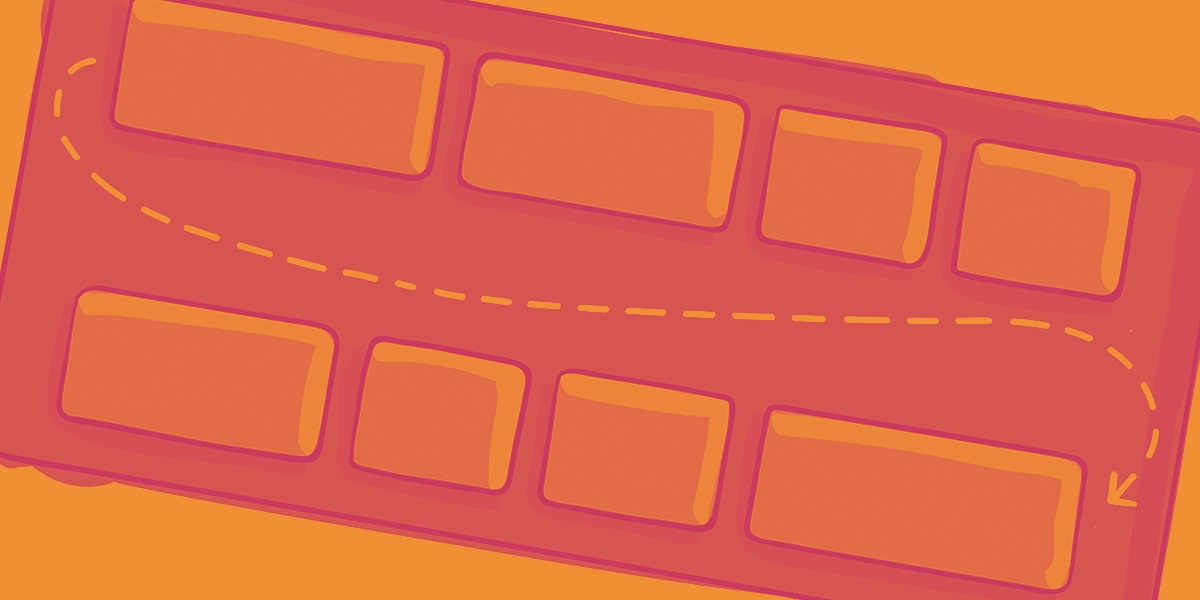
CSS Flexible Box Layout, commonly known as Flexbox, is a powerful tool for creating responsive web designs. Ever wondered how websites adjust so smoothly across different devices? Flexbox is the magic behind that. It allows developers to arrange elements in a container, distributing space and aligning items efficiently. This layout model is a game-changer for web design, making it easier to create flexible and dynamic layouts without the hassle of floats or positioning. Whether you're a seasoned developer or just starting, understanding Flexbox can significantly improve your web design skills. Ready to dive into some intriguing facts about Flexbox? Let's get started!
What is CSS Flexible Box Layout?
CSS Flexible Box Layout, commonly known as Flexbox, is a layout model designed to help developers create complex layouts more efficiently. It provides a more flexible way to arrange items within a container, making it easier to design responsive web pages.
-
Flexbox was introduced in 2009 as part of the CSS3 specification. It aimed to address limitations in traditional layout methods like floats and positioning.
-
The main concept behind Flexbox is the ability to distribute space along a single axis, either horizontally or vertically. This makes it ideal for creating dynamic and responsive layouts.
Key Properties of Flexbox
Understanding the core properties of Flexbox is crucial for mastering this layout model. These properties control the behavior and alignment of flex items within a container.
-
The
display: flex;property is used to define a flex container. All direct children of this container become flex items. -
The
flex-directionproperty determines the direction of the flex items. It can be set torow,row-reverse,column, orcolumn-reverse. -
The
justify-contentproperty aligns flex items along the main axis. Options includeflex-start,flex-end,center,space-between,space-around, andspace-evenly. -
The
align-itemsproperty aligns flex items along the cross axis. Choices includeflex-start,flex-end,center,baseline, andstretch.
Flexbox Alignment and Ordering
Flexbox offers powerful alignment and ordering capabilities, making it easier to create visually appealing layouts.
-
The
align-selfproperty allows individual flex items to be aligned independently of others. It can override thealign-itemsproperty for specific items. -
The
orderproperty changes the order of flex items within a container. By default, all items have an order value of 0, but this can be adjusted to reorder items as needed. -
The
flex-growproperty specifies how much a flex item should grow relative to others. A value of 1 means the item will grow to fill available space, while 0 means it won't grow at all. -
The
flex-shrinkproperty determines how much a flex item should shrink relative to others. A value of 1 means the item will shrink to fit within the container, while 0 means it won't shrink.
Flexbox and Responsiveness
Flexbox is particularly useful for creating responsive designs that adapt to different screen sizes and orientations.
-
The
flex-wrapproperty controls whether flex items should wrap onto multiple lines. Options includenowrap,wrap, andwrap-reverse. -
The
align-contentproperty aligns flex lines within a container when there is extra space. Choices includeflex-start,flex-end,center,space-between,space-around, andstretch. -
The
flex-basisproperty sets the initial size of a flex item before any available space is distributed. It can be specified in pixels, percentages, or other units.
Practical Applications of Flexbox
Flexbox can be used in various scenarios to create modern, responsive web layouts.
-
Creating a navigation bar is a common use case for Flexbox. It allows for easy alignment and spacing of menu items.
-
Building a responsive grid layout is another popular application. Flexbox makes it simple to create grids that adapt to different screen sizes.
-
Flexbox is also useful for centering content both horizontally and vertically within a container, a task that can be challenging with traditional layout methods.
-
Finally, Flexbox can be combined with other CSS layout models like Grid to create even more complex and flexible designs.
Final Thoughts on CSS Flexbox
CSS Flexbox is a game-changer for web design. It simplifies layout creation, making it easier to build responsive, flexible web pages. With properties like flex-direction, justify-content, and align-items, you can control the alignment and distribution of space among items in a container. Flexbox also supports complex layouts with minimal code, reducing the need for floats and positioning tricks.
Understanding Flexbox can save you time and headaches. It’s a powerful tool that can handle both simple and complex layouts with ease. Whether you’re a beginner or an experienced developer, mastering Flexbox will enhance your web design skills.
So, dive into Flexbox, experiment with its properties, and see how it can transform your web projects. The more you practice, the more intuitive it will become. Happy coding!
Was this page helpful?
Our commitment to delivering trustworthy and engaging content is at the heart of what we do. Each fact on our site is contributed by real users like you, bringing a wealth of diverse insights and information. To ensure the highest standards of accuracy and reliability, our dedicated editors meticulously review each submission. This process guarantees that the facts we share are not only fascinating but also credible. Trust in our commitment to quality and authenticity as you explore and learn with us.


